
Your Data,
Your Dashboard
Designing a flexible dashboard builder that empowers non-technical users to create custom analytics views from any data source.

Democratizing data visualization for everyone
This project focused on designing a no-code dashboard builder that enables business users to create, customize, and share analytics dashboards without requiring technical expertise or developer resources.
Organizations sit on valuable data but often lack the resources to build custom dashboards for every team. Our goal was to put dashboard creation in the hands of the people who understand the data best: the business users themselves.
The details at a glance
What we set out to achieve
Design a dashboard builder powerful enough for data analysts yet simple enough for marketing managers.
The platform needed to balance flexibility with simplicity: offering enough customization to handle diverse use cases while maintaining an interface that doesn't overwhelm users who aren't data professionals.
My contributions to the project
-
1
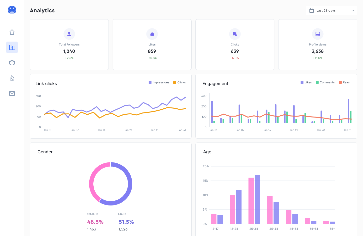
Widget Library Design Created extensible library of charts, tables, and KPI widgets with consistent styling
-
2
Drag-and-Drop Builder Designed intuitive canvas with grid snapping, resize handles, and layout templates
-
3
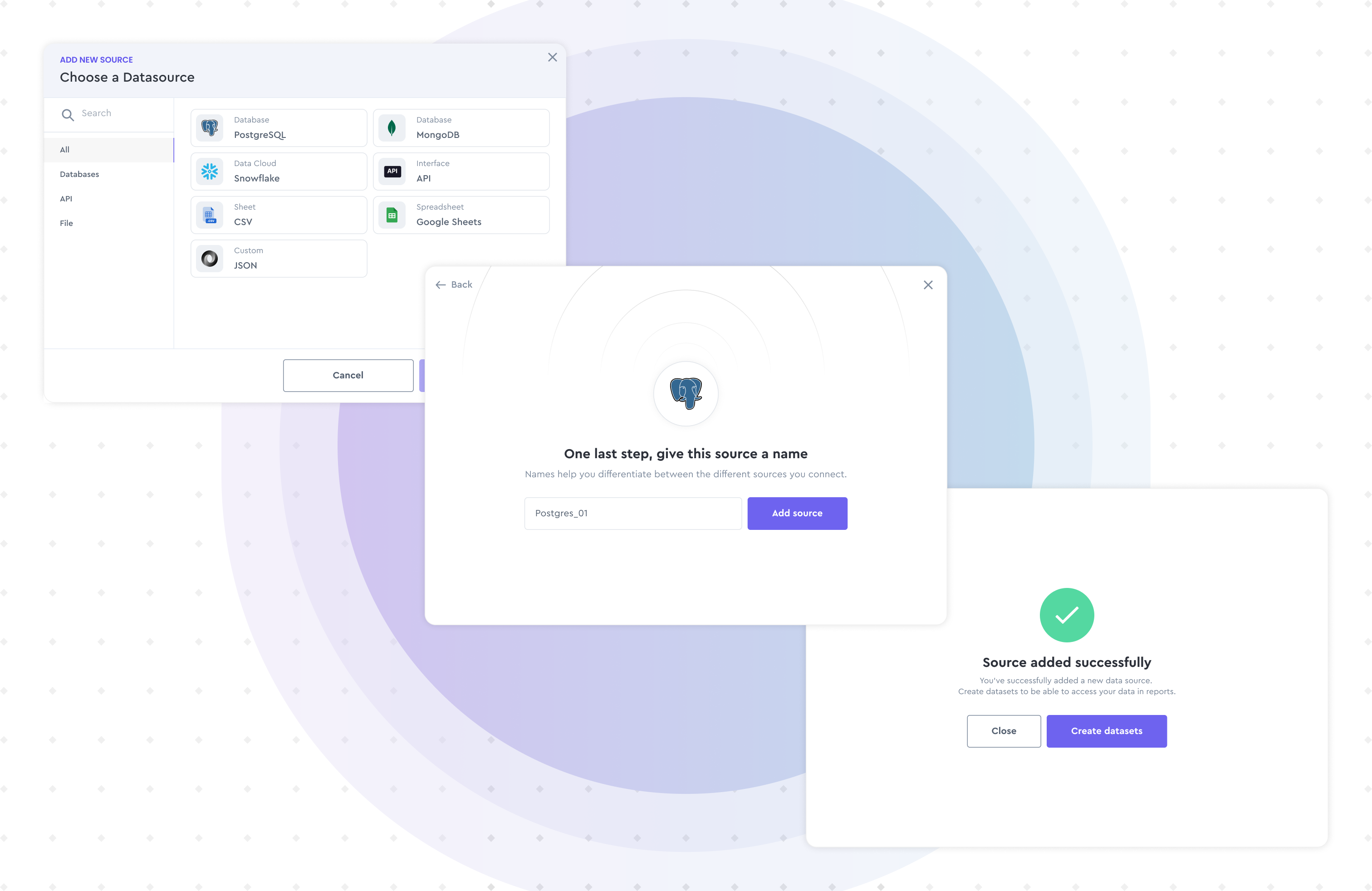
Data Connection Interface Created visual data mapping tools for connecting widgets to data sources
-
4
Sharing & Permissions Designed dashboard sharing with view/edit permissions and embed options
-
5
Mobile Responsive Design Created adaptive layouts that automatically optimize for different screen sizes
Aligning design with business objectives
Reduce IT Dependency
Enable business teams to create dashboards independently, reducing the backlog on development resources.
Increase Data Adoption
Make data accessible and actionable for non-technical users across the organization.
Standardize Reporting
Provide consistent visualization standards while allowing customization for specific needs.
Understanding the problem space
We studied how different teams use data and interviewed users ranging from data analysts to department heads to understand their visualization needs and technical comfort levels.
Key Research Methods
-
→
Contextual Inquiry Observed users building reports in existing tools
-
→
Persona Development Created 5 personas from casual viewer to power user
-
→
Card Sorting Tested widget categorization with 30 participants

From insights to solutions
The ideation phase focused on creating a builder that feels familiar to spreadsheet users while offering the power of professional BI tools. We prioritized templates and smart defaults to reduce the blank canvas problem.
Template Library
Industry-specific templates that give users a head start and demonstrate best practices.
Smart Suggestions
AI-powered recommendations for chart types based on selected data fields and common patterns.
Collaborative Editing
Real-time collaboration features that let teams build and refine dashboards together.
Bringing the vision to life
Impact and results
The platform transformed how the organization interacts with data. Business teams now create dashboards independently, reducing the BI team's backlog by 70% and enabling faster decision-making across departments.
What this project taught me
The best dashboards aren't built by designers; they're built by the people who need the answers.
This project taught me that empowering users often means constraining options thoughtfully. Too much flexibility paralyzes; smart defaults liberate.
The breakthrough was recognizing that templates aren't limitations; they're starting points. Users who started with templates created better dashboards faster than those who started with a blank canvas.